New year, new look.
For the past 17 years, boberdoo has been building the SaaS solution for the lead generation and online marketing industries. We continually strive to provide our users with the necessary tools to be successful within this competitive landscape.
Although the features of our system are second to none, we have always been transparent as a company and do our best to improve our software whenever possible. Because of that, we have begun making significant strides to improve the user experience (UX) and user interface (UI) of our lead distribution software. As we like to say, there are enough things to worry about in the lead industry and your lead distribution software shouldn’t be one of them.
This is the first of many posts in a series that will update you on the UI/UX enhancements and increased usability of the boberdoo system.
Disclaimer: The designs included below are initial mocks of future UI/UX improvements. These designs are subject to change in the coming months.
What is UX design?
User experience design is the analytical process of making a product (phone, software, website) more enjoyable and usable for the end user.
What is UI design?
User interface design supports the UX design visually through colors, graphics and layout. Think graphic design but for websites and applications.
In short, UX design makes software functional and UI designs makes software beautiful.
Features
Overall, we aimed to design a cleaner more standardized user interface.
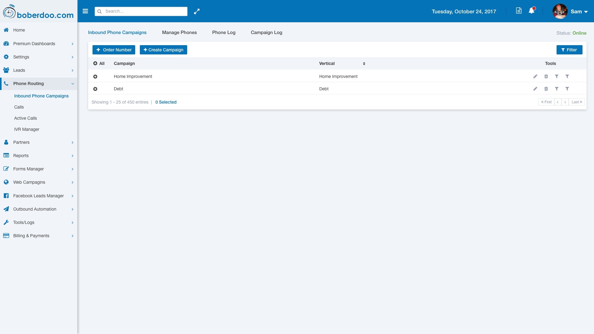
Header

- Collapsible side menu
- Advanced system search functions
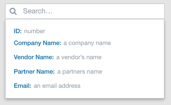
- Full screen mode for increased screen real estate
- Visual system notification updates with highly customizable settings
- New account personalization menu
Side Menu
- Reorganization of content into main parent menus
- Elimination of lengthy child and grandchild submenus.

Data Tables
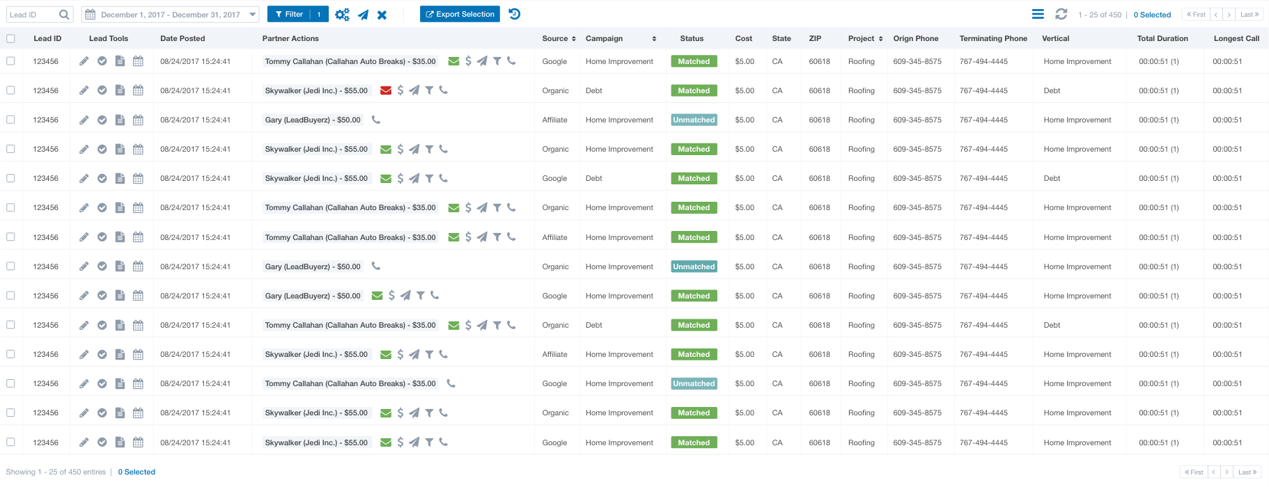
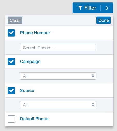
- Standardization of data alignment
- Zebra striping removed
- Enhanced filter menu
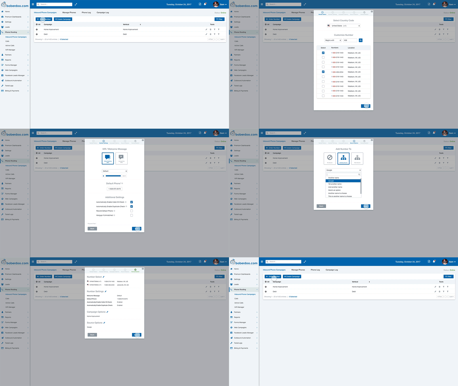
Curated set up wizards
Curated wizards will better assist our users when creating or adding content to their boberdoo system:
At boberdoo, we love nothing more than continually improving our software and helping our clients get the absolute most out of their lead businesses. These UI/UX improvements and many more are top priorities for us in 2018 and we will keep you updated every step of the way.

Got any specific sticky points in the leadsystem that you'd like to see improved? Let us know!
